Tales of Bittersweet Loyalty

Author Archive

Dear Baseball: We Can Still Be Friends

In Atlanta, Baseball, Loyalty on July 18, 2011 at 7:00 AM

Baseball and I, we met at Parker Field in Richmond, Virginia in September of ’83. It was a hot, humid night. A thunderstorm loomed in the west, just above the stadium lights.

Alright, most of that isn’t true. I do know that we met at Parker Field, but I have no idea when it was. I don’t even remember Parker Field. It was torn down in 1984 when I was 6, and I’m not that good at remembering things anyhow. Parker Field was the home of the Richmond Braves, Atlanta’s top farm team. Its replacement, The Diamond, opened in 1985 and is still there today. The R-Braves are not.
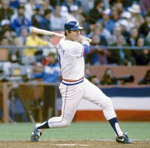
Since Richmond was the final stop for kids on their way to Atlanta, I saw some great players: Glavine in ’87, Smoltz in ’88, Justice in ’89, Chipper in ’93. I’d later see these same kids on TBS every night. It never really seemed like I had a choice: The Atlanta Braves became my favorite team. By the time I’d moved on from tee ball, I had Dale Murphy posters plastered on my wall. I was mimicking Ozzie Virgil’s catching stance. I was convinced Zane Smith was the best pitcher ever. Remember, though, the Braves sucked for most of the 80s. They were horrible.  Really, truly horrible. My friend Jason always made fun of the Braves. And he was a freaking Blue Jays fan.

And then ’91 happened. That’s when baseball and I really hit it off. That’s when we took our relationship to the next level.

(To this day, I hate Kent Hrbek. I still check and see if the Giants or Reds lost, even though it’s been almost 20 years since they were in the NL West together. I’d put Mark Lemke in the Hall of Fame. I think Terry Pendleton deserved that MVP.)

Baseball and I spent a lot of time together in those days. Baseball cards provided me the first opportunity to refine my obsessive organizational skills. I watched Baseball Tonight religiously. Every year in early July, I’d plan out All-Star Game night: The right TV angle, the best position on the couch, dinner, the dessert. I could tell you every team’s opening day lineup. I created each All-Star team in Baseball Stars (SHEFLD of the ‘92 National League team was an absolute monster). I’d watch the Cubs on WGN in the afternoon and then the Braves at night on TBS.

But somewhere along the line, at some point in our relationship, things began to change.

It had nothing to do with The Strike. Strikes happen. It had nothing to do with The Steroids. I would have probably done steroids if I played pro baseball.  And it had nothing to do with The All-Star Game Determines the Home Team in the World Series. Oh, I know it’s really stupid, but it’s a small blip on the radar. None of those really pushed baseball and I apart.

There were some little things I started to notice, little pet peeves that I thought our love could overcome. At times, ESPN’s coverage of baseball (everything, really) stumbled into yellow journalism. Joe Morgan, Joe Buck and Tim McCarver made watching baseball almost unbearable.  The lack of any sort of competitive balance went from annoying to bothersome to deplorable in a matter of years. The Hall of Fame voting. TBS dropping regular coverage of the Braves. I was sure we could weather those storms.

See, I never wanted to admit that I saw the end coming. But my eyes began wandering a bit. I mean, have you seen hockey in HD? I began thinking about others more, thinking about spending more time with football. But I always came back to baseball. This distance between us, it grew in the tiniest of increments, and then one day, I woke up and those little increments had become one giant gulf.

I didn’t seem to know baseball anymore. I couldn’t tell you many opening day lineups. I didn’t know where some free agents had gone. (Jeff Francoeur is on the Royals now? And he was on the Rangers last year?) I can’t tell you the Braves’ 25-man roster right now. I’ve even skipped World Series games. I admit there were World Series games where I didn’t see a single pitch. I saw my friends spending more and more time with baseball and began to feel guilty (yes, I’m talking about you, Wells).

And there was that day, the day when I learned something about baseball that I couldn’t fully live with. On the surface, it didn’t seem like a big deal. But it felt like a big deal: That seedy underbelly of your family-friendly, hometown Minor League Baseball. The way small cities and communities are cowed into giving up the farm for a team that was once the pride of another community. The way these small baseball teams could hold towns hostage. They tell me that, after all, baseball is a business. But that doesn’t really make it any less ugly.

Remember Richmond, where baseball and I met? Allow me to digress. Those very same R-Braves, they moved to Richmond in 1966, the same year the big league Braves moved from Milwaukee to Atlanta. For the next 43 seasons, the R-Braves were Atlanta’s top minor league team. Freaking Dusty Baker played for the R-Braves, that’s how long they’d been around.

The R-Braves were owned by their parent club in Atlanta. They’d seen The Diamond and they knew it was a pit. A giant, sterile, concrete pit. It was old and dated before the first pitch. They came to town, and they told the Richmond, “We want a new stadium. Richmond should build us a new stadium.” (Not an exact quote.)

The “…or else” is always understood. When minor league team owners get antsy for a new stadium, they make a trip down to your City Hall, schedule a couple of lunch meetings with your Elected Officials. There is always another city who will build a state-of-the-art, shiny new stadium. And the Richmond VIPs made the decision (or non-decision) to take some time and explore their options. In the end, though, the R-Braves became the Gwinnett Braves after the 2008 season. Go find Gwinnett on a map.

(Postscript: A year later, Richmond got an Eastern League franchise affiliated with… wait for it… the San Francisco Giants.)

Richmonders had been going to R-Braves games for 43 years. LBJ was still President. Richmond was a stalwart of the International League, a five-time champion. But Gwinnett County was willing to put their taxpayers on the hook for a stadium that won’t be paid off until 2038. The taxpayers pay for the facility and its maintenance, the team keeps ticket and concessions revenue.

It’s a good business model for the team. It sucks for everyone else. Head up north and ask Edmonton about Nolan Ryan moving the city’s team to Round Rock, Texas. Ask Ottawa about the Lynx. Next year, ask Yakima, Washington and Kinston, North Carolina. Hell, go ask the fine people of Portland, Oregon: They’ve made getting screwed by baseball franchises into an art form.

I’ll paraphrase Henry Hill from Goodfellas for the kids: Screw you, pay me.

So, what does all of this have to do with me and baseball? We all grow up and with age comes a little perspective. A reshuffling of priorities. Perhaps a little touch of cynicism. I wasn’t too old to love baseball, I just didn’t love it the same way. I could no longer buy into the idea that baseball should be as loyal to its fans as its fans are to it. The fans always lose that fight. And that’s when baseball and I went down to the courthouse and filed. Irreconcilable differences.

My baseball cards, they’re in a box in the basement. I don’t get (that) mad anymore when I think about how Dale Murphy isn’t in the Hall of Fame. I own a Minnesota Twins t-shirt. And I’ve been known to wear it.

Some days I do miss what baseball and I had. And don’t misunderstand me, baseball and I still talk. Some nights the wife and the kid, we all get together and spend some time with baseball, watching the Braves when they’re on. We watch Dan Uggla ground into double plays and Derek Lowe throw his 88 mph fastball and I think back to the Braves of the 1980s. I follow Dale Murphy’s Twitter feed. I’m counting down the days until I can play catch with my son.

Baseball and I, we still have those memories. A Sunday game at Camden Yards. That 1995 World Series. McGwire’s home run (despite all that came later). Miserably hot Spring Training games in Arizona. And I still plan on creating new memories with baseball: There are many more stadiums to visit, many more teams to see. And I’ll always love the game’s history: The cowboy days of the 1800s, the turn of the century chaos, etc.

But our relationship, it’ll never be the same as it was.

The Goddess of Victory Forgives and Forgets

In Football, Philadelphia on July 11, 2011 at 7:00 AM

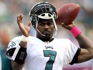
A few months ago, the NFL handed out its awards for the 2010 season. One of those awards went to Michael Vick, who was named the Comeback Player of the Year by the Associated Press. On the surface, it makes sense: The previous season, he completed 6 passes for 86 yards as the backup to Donavan McNabb.  Before that, he hadn’t played since 2006.  This past season, however, he threw for over 3,000 yards, rushed for another 700 or so and had a total of 30 touchdowns. I watch a lot of NFL, and there’s no doubt this was the most dramatically pronounced improvement of any player in the league.

Before I continue, it’s important I disclose to you that I hate Michael Vick as much as you can hate someone you’ve never met.

I realize that sounds pretty harsh. But I personally believe that animals have intrinsic value, that they do not exist solely to serve as means for our ends. That means all of the following: I find any testing done on animals deplorable, regardless of the real or perceived benefits to mankind; I consider the very idea of purchasing an animal—any animal—offensive; I believe the very idea of hunting and fishing as “sport” is a blight on mankind; and I believe Gandhi said it best when he remarked, “The greatness of a nation and its moral progress can be judged by the way its animals are treated.”

I’m well aware that these views may verge on heresy for some. I’m fine with that. I don’t hold animals in higher regard than humans, and nothing I say about Vick would suggest otherwise.

But Vick’s actions aren’t simple. They require analysis way above my pay grade. It’s not as easy as evoking “they’re just dogs.” 99% of those who’ve uttered “they’re just dogs” would not stand by and allow something like dog-baiting to occur in their presence. Vick didn’t simply participate in dogfighting. He led and financed an interstate crime syndicate, and he hosted it on his own property. He hung and drowned dogs who “underperformed.” It’s not an issue of culture—that defense is as racist as it is ridiculous. It’s not an issue of mankind’s dominion over animals. It’s a question about the very value of life. I truly believe that Vick’s lack of respect for life extends to humans. I truly believe that Vick will be forever incapable of understanding the gravity of his actions.

With all of that out of the way, we arrive at the question that was posed recently here at Perfecting the Upset: Do we, the fans, forgive and forget athletes’ transgressions too easily?

The short answer? Yes. Absolutely. In general terms, athletes are held to a lower standard than the rest of us. To some extent, we expect athletes to screw up: Drunk driving, domestic violence, hanging out with the wrongest of crowds at the wrongest of times and places, etc. That’s why they seem to receive relatively minor punishments for behavior that would ruin the lives of the rest of us. There was a time a few years ago where it seemed like every member of the Cincinnati Bengals had been arrested for something. It became a running joke on the sports talk radio circuit. The details of the alleged crimes didn’t matter after a while.

When Vick was sentenced to 23 months in prison, many were outraged at the severity of the punishment. It was frequently weighed against the punishment given to Leonard Little, the St. Louis Rams’ defensive end who ran a red light and plowed into another car. He was drunk, over the legal limit and he killed the woman in the other vehicle. His punishment was four years probation and 1,000 hours of community service. He was suspended for eight games by the NFL. Little killed a woman and received no jail time. Vick killed dogs and ended up in Leavenworth for almost two years. People said, “Something’s wrong with that.” And they are absolutely right: The two punishments were way out of whack. But the problem wasn’t that Vick’s punishment was too severe; it was that Little’s wasn’t severe enough. How many of you even know who Leonard Little is, much less remember his crimes?

Just a few days ago, Nike signed Vick to an endorsement deal four years after they severed ties with him. Forgive and forget? Nike weighed the pros and the cons and they came to the conclusion that it makes business sense to have Vick out there on their behalf. Nike is banking on the fact that those of us who buy their products have forgiven by now (or don’t care). Nike can take the hit from those who, like me, will never buy another Nike product.
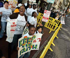
The Philadelphia Eagles had faith that their fans had forgiven Vick by 2009. He’s now the face of the franchise. The Ed Block Courage Award Foundation believed fans had forgiven Vick when they gave him their award the same year. The general consensus on talk radio is that he is forgiven (or, in some cases, there was nothing to forgive in the first place). The Humane Society has allowed Vick to participate in their End Dogfighting campaign. President Barack Obama forgave Vick, praising the Eagles’ owner for giving Vick a second chance. Obama said that “too many prisoners never get a fair second chance.” Then again, how many prisoners have PR teams and Tony Dungy vouching for them in the special, peculiar Tony Dungy kind of way?

I don’t think anyone has forgotten, though. Vick’s name will be forever synonymous with dogfighting. In the end, it seems that forgiving is more important and easier than forgetting. Forgiving is especially easy when it accompanies winning. Winning is very powerful force. Kobe Bryant has been forgiven since his rape charges in 2003. The eight years have helped, but the Lakers’ two championships really helped. Ray Lewis led the Ravens to a win in Super Bowl XXXV and was named its MVP. This was a year after his involvement (to whatever extent) in the stabbing deaths of two people. His past transgressions might even be forgotten at this point. When we talk about Lewis now, we talk about his place in the pantheon of football players, not his past.

Forgiveness does not require winning, though. Winning just makes it easier. What forgiveness should require is remorse, some sign that the transgressor knows the wrong in their transgression. Some people don’t care if he’s remorseful at all. Many people believe Vick is genuinely remorseful and these people are closer to Vick than I am. When he walked out of prison a free man, he had a goal to be back in the NFL. We had the expectation he would be back. We wondered what team would take that risk. Vick is back to making many millions of dollars playing football and many of us are back to cheering him on.

I have a hard time believing that Vick’s total lack of compassion can be overcome with a little less than two years in prison. I hear him say, “My daughters miss having [a dog], and that’s the hardest thing: Telling them that we can’t have one because of my actions.” That doesn’t show me that he learned anything or that he’s rehabilitated. It shows me there’s still a bit of a persecution complex lurking beneath the polished and prepared talking points.

It has been said that he paid his “debt to society.” I’m not sure what that means. But obviously many people do. If he continues to play as he did in the 2010 season, if by some miracle the Eagles win a Super Bowl, the percentage of people who forgive will increase. That’s how it works, for better or for worse.
So, do we sports fans forgive and forget too easily? If Leonard Little can slam into a woman while driving drunk and play in the Super Bowl less than a year later, the answer is yes. If it only takes four years to go from the most vilified athlete, possibly ever, to being the Comeback Player of the Year and making $20 million, the answer is yes. If the decision to forgive is in any way based on the success of the player, the answer is yes. And it’s not just the fans: The establishment, the leagues, the companies—they all forgive too easily.

A fellow contributor here commented, “America sure loves a comeback story, huh?” We do indeed. And Vick’s comeback is one we rarely see. His comeback is truly amazing. What that comeback signifies about sports fans, what it says about our society and what it teaches the kids that may look up to him, remains to be seen.

Perfecting the Top 10: Historic Team Logos

In Baseball, Basketball, Football, Hockey, Loyalty, Perfecting the Top 10 on July 2, 2011 at 10:00 AM

Logos are important. They are a team’s identity, the common element that we recognize, that we react to. If a Yankees fan sees those two red socks on the back of a car, they know the car belongs to a Red Sox fan. If you want to know the power of a logo, break out your Cowboys t-shirt at FedEx Field (please do not do this).

I have limited background in design. I’m no expert. I just like logos. I’m not going to break down each element of a logo, but I do look at the font, the colors, the link with the team name, the complexity (or “busyness” you could say) and so on. Some logos just have that somethin’ special.

I’m limiting the pool to the Big 4: MLB, NFL, NBA and NHL. Defunct or relocated teams count. MLS isn’t old enough, and there are way too many colleges out there. A current logo qualifies as historic if it was being used, say, since 1985 (over 25 years).

10. Chicago Cubs: 1979 – present (MLB)

The Cubs have been around forever. If it weren’t for that pesky Great Chicago Fire costing them the 1872 and 1873 seasons, they would be the oldest sports franchise in the country. Since the late 1900s, the Cubs have kept the same basic theme with their logo: A large “C” and something in the middle. In the first part of the century, it was usually a bear. Since the 30s, it’s been “U-B-S.” The latest (and best) incarnation came about in 1979 and has seen the likes of Sandberg, Dawson, Maddux and Sosa. It’s simple and clean and contained completely within a circle. I don’t typically like logos that are entirely contained within a circle, but the interior “C” helps to break up the circle’s impact visually. You can never go wrong with red and blue. It doesn’t tell you anything about Chicago or their mascot, but it does tell you something very important about the Chicago Cubs: They’re a historic franchise that have never needed a huge makeover. Their logo is a fairly modern take on a simple concept. It’s proof that sometimes simpler is better.

9. Portland Trail Blazers: 1970/71 – 1989/90 (NBA)

This is the lone NBA representative on this list. And it seems an unlikely choice. There’s nothing in this logo that tells you anything about the team. Absolutely nothing. Some people suggest that the logo is a backwards “p” and “b” but I can’t verify that. The font used in the wordmark is certainly echoed in the logo. And if you’re willing to take it a step further, you could probably get a “t” out of there. Anyhow, at first glance, it does have some things going for it: Clean lines, a simple and distinct shape and it’s self-contained without being completely enclosed in a circle. The logo creates a sense of movement, and it feels dynamic despite its simplicity.

I also like the choice of non-traditional colors. I read one comment that said black and red were used to mark the Oregon Trail but haven’t been able to verify that via an admittedly brief Google session. If it is true, that’s a stroke of genius. But there’s another stroke of genius, one that’s far more subtle. Both the red element and the black element are made up of five lines. And, of course, basketball is a game of five on five. So you have a (very) abstract representation of the game the Trail Blazers are playing. You can even take it further and suggest that sense of movement brings the five lines to meet in the circle at center court. One last thing: It just screams classic 70s.

8. Minnesota North Stars: 1967/68 – 1973/74 (NHL)
Perhaps hockey teams seem to spend a little more time than other sports on their image and identity. Or it may be because their logos appear more prominently on their uniforms. It may be because a lot of these teams showed up later on when identities became more important with more exposure. Until 1967, there were only six teams in the NHL. At that point, the league doubled in size. One of those teams was the Minnesota North Stars.

None of the expansion teams of ’67 were Canadian. The team farthest north was Minnesota. And when you think hockey, you look north. Like the Cubs logo, this one is simple and easy to use in various formats. It gives you an idea where Minnesota is in relation to the other American teams and evokes the team’s branding. The “N” has a nice fluidity; it creates a sense of movement that leads you to the star. The star fits snugly into the arrow, which is pointing up, the usual direction for north. Not only does it lead you into the star, but it takes you north to hockey’s homeland. And of course the star is yellow which always goes well with green. When the North Stars moved south to Dallas, they dropped the “North” and the logo lost everything that made it special.

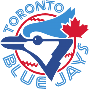
7. Toronto Blue Jays: 1977 – 1996 (MLB)

This is a complex logo. It has a lot of competing pieces, lots of swooping lines and a non-traditional font. At the same time, for a logo from the 70s, it has a surprisingly modern representation of a blue jay: Angular and abstract. It incorporates Canada’s maple leaf without distracting the viewer from the rest of the logo. While I’m not a fan of using sports equipment in a logo, it seems to work here: The ball creates focus and helps define the logo’s shape that might otherwise seem to sprawl in all directions. The blue is an obvious choice but the red is not. Blue and red verges on the traditional American colors used by a number of teams. But here it provides a contrast that helps to, again, focus the logo and contain its pieces. If you ignore the text, it tells you most of what you’d need to know: the team is Canadian, probably called the Blue Jays and they play baseball.

And when you compare it to their horrible current logo, this logo is a work of art, worthy of a wall at the Louvre.

6. Pittsburgh Steelers: 1963 – present (NFL)

You should know this logo. This logo probably violates any rule I could put on paper about what logos should or should not do. It’s completely surrounded in a circle, it contains colors that are not part of the team’s official colors, it’s basically copied from another organization’s logo. And so on. The logo’s history tells part of the story. It was created in 1960 for the American Iron and Steel Institute, and it originally said just “Steel” on the left side. The three shapes on the right side are called astroids, which are “hypocycloids with four cusps” (yeah, I know, just go here). A company called Republic Steel (from Cleveland!) asked the Steelers’ owners about putting the logo, the Steelmark, on their helmets. In 1963, the Steelers asked if they could change “Steel” to “Steelers” and there you have it. The colors do mean something: Yellow is coal, red (originally orange) is iron ore and blue is for scrap metal. So that the Steelers could trademark it, they made the astroids bigger and changed the middle one to red.

So, how does all of this make a good logo? Because what started as the symbol for an industry turned into one of the most iconic brands in not just the NFL but all of professional sports. It shows how seemingly random shapes and colors can come together in a clean, classic design. And to underscore all of that, what amounts to an advertisement for the steel industry turned into the logo for a football franchise that had been around for 30 years before the logo even existed. Can you imagine that happening today? Scratch that and try this: Can you imagine that happening so overtly today?

5. California Golden Seals: 1970/71 – 1973/74 (NHL)
Wait, you’ve never heard of the California Golden Seals? Well, you’re in good company. I doubt anyone who wasn’t a hockey fan in the 60s and 70s has. They were part of the expansion in 1967 that also brought the North Stars to the NHL. They were the California Seals, then the Oakland Seals and then finally the California Golden Seals. After that, they moved to Cleveland and then merged with the North Stars. But while they were in the Bay Area, the Seals kept the same basic logo: An abstract seal with a hockey stick coming out of a “C.” I’ll admit that this logo didn’t catch my eye when I first saw it. But like the Trail Blazers logo, it grew on me. There are no hidden pieces, no subtle elements. It’s just a straight logo, and that might be the part I like the most. It’s got a lot going on but it’s not overwhelming.

The “C” is good: As I’ve said, as a general rule, logos should use circular elements to contain most of the logo, not all of it. Even when they were the Oakland Seals, the seal’s head spilled out of the “O” (that was converted from the “C”). The seal is not a simple. Like the Blue Jays’ logo, the representation is remarkably ahead of its time. And like the Blue Jays’ logo, the animal isn’t represented as aggressive, but as neutral or even “happy” as was common before the 90s. The aggressive animal logo phenomenon came later and is all the rage over the past 10 or so years (see the most recent logo changes for the Seahawks, Lions, Dolphins, Blue Jays and nearly every minor league baseball team).

Of course, a seal is a good choice for a team name in the Bay Area, it being home to the California sea lions and harbor seals. Additionally, there was the San Francisco Seals, the minor league team that Joe DiMaggio played for. The fact the seal is holding a hockey stick is something I’d normally dislike but here it helps to balance the composition. There’s a lot of unused space inside the “C” which was filled in with green. I’m okay with that, too, for the same reason: It gives the logo a nice balance and helps the yellow elements stand out.

This is the kind of fun logo you’ll never seen again. It would be considered too flat, too static, too something. But it’s bold and holds up well to this day. It’s a good mix of an old football or baseball logo and something you might see today. To that effect, this is a unique work that we may never see the likes of again.

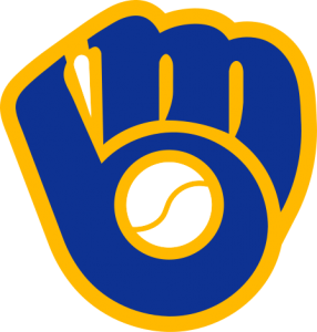
4. Milwaukee Brewers: 1978 – 1993 (MLB)

I remember always seeing this logo on baseball cards and thinking, I don’t understand why the Brewers use a glove and ball as their logo. I just didn’t get it. And it took me a while to get it. My wife, on the other hand, got it immediately when she saw it. It’s an “m” and a “b” of course, and it’s flawlessly molded into a baseball glove, the empty space in the “b” serving as a baseball. It has a cartoonish quality to it: The font is bubbly and uneven, the outline is thick and the ball is, well, anatomically incorrect. But these qualities give it that fun quality. It’s a nice reminder that, hey, sports can be fun sometimes.

This logo is also a good example of how a team can create an identity crisis for itself. It establishes an identity, sticks with it for a long time, and then changes it for no apparent reason. This logo was on the hats of Robin Yount, Paul Molitor and Rollie Fingers. And then the team altered its colors, did away with the ball and glove logo and created an entirely new identity. And a decade later, the Brewers brought this logo back as a third uniform. The Blue Jays did the same thing. There’s a reason people like throwback uniforms: They’re usually better.

3. Montreal Expos: 1969 – 1991 (MLB)

We’re going north of the border again. When I was a kid, I watched the Atlanta Braves on TBS religiously, and they seemed to be playing in Montreal 100 times a year. I always wondered about the logo on their hat: It appeared to spell out “elb,” and I had no idea what that meant. A former co-worker of mine was an Expos fan.  (Really, his license plate was “XPOSFAN”.) He told me that it spelled out “eMb”  with the “e” and “b” forming part of the “M”. Admittedly, the “M” is hard to see at first, but it’s there and stylized in a way that feels like it represents Montreal well (though I cannot tell you why).

So, why “eMb” then?  Well, in French, it stands for équipe de Montréal baseball, which translates into “Montreal Baseball Team.” But, wait, there’s more! Shuffle those letters around and you get “Meb” and they left it in English for you: “Montreal Expos Baseball.”

So in one little, three-color shape you have the team’s insignia, a description of the organization in French and a description of the club. It’s simple and unique and stands out as one of the better baseball logos in history. It may not be iconic like the Yankees’ “NY” or the Brooklyn Dodgers’ “B”, but it’s clever and captures that certain je ne sais quoi.

2. Hartford Whalers: 1979/80 – 1991/92 (NHL)

When the Whalers moved to Raleigh and became the Carolina Hurricanes, this logo disappeared from the sports world. This is one of those logos that probably flew under the radar: It’s a very small city in the fourth sport of the Big 4. I’m not a big fan of whaling and all, but I’m pretty sure there’s no other team called the Whalers in the sports world (unless there’s some small liberal arts college playing Division III basketball I don’t know about). The Whalers’ logo took advantage of an design element you rarely see: Negative space. Think the FedEx logo, the way the white area between the “E” and the “x” forms an arrow. You probably never noticed it. But once you see it, you’ll never stop seeing it. That arrow is the negative space.

In this logo, you have the “W” at the bottom. Pretty obvious. At the top, you have the two flukes. That alone would be a pretty decent logo. But graphic designers are sometimes pretty damn good at what they do. And good ones will use that negative space when it can be used effectively. In-between the “W” and the flukes you have a stylized “H”. So, in one compact space you have the first letter of the city, the first letter of the team name, and a graphical representation of the team name (or what the team name would be killing, I guess). Another nice touch is that the outsides of the “W” are rounded to give it the feel of water. It’s like the tail is coming out of the water.

This logo is similar to the Expos logo in what it accomplishes. It takes a lot of pieces and puts them in a clean, simple form. There’s nothing flash about it. It doesn’t use a lot of colors or any sense of depth to give the team an identity. And like the Expos logo, it manages to endure even though the team itself is no longer around.

1. Vancouver Canucks: 1970/71 – 1979/1980 (NHL)

I don’t know where to begin with this logo. So many things are represented in such a simple design. If there’s a problem with it, it’s that people don’t know what’s being represented. It’s too damn good for its own good.

The somewhat obvious: It’s contained within a hockey rink and there’s a hockey stick cutting across the right side. Thus the nickname “stick-in-rink” logo. Some people don’t pick up on the rink but the stick is clear. The colors weren’t just chosen because they look good together (they do) but because they represent three natural characteristics of Vancouver: The blue water, the green trees and the white snow of the mountains. Then we begin to dig deeper. The hockey stick breaks the outline and creates a very, very stylized “C”, and one could go so far as to say that the negative space in the stick itself serves as a very shallow “V”. Then you get to the flat out esoteric: That hockey stick forms the mouth and jaw line of an abstract whale head.

I know a lot of people hear all of this and just shake their heads. That’s the problem I mentioned earlier: A lot’s going on but it’s all really subtle. Even the “C” is subtle. Most people see a hockey stick in a swimming pool. Even if this was simply a hockey stick in a swimming pool, it would still be one of the best logos ever created. It’s clean, simple and nice to look at.

In the end, logos often define a team’s identity. You’ll always know that the hockey stick in the swimming pool logo belongs to the Canucks. The longer a logo sticks around, the more entrenched that identity gets. That’s why some baseball teams can hang on to the most generic of logos (think the Tigers’ script “D”). No sports fan in North America is going to look at that and wonder what team it is. But for teams that haven’t been around since the turn of the century, you have to create an identity and stick with it, good or bad (good’s usually better, though).